

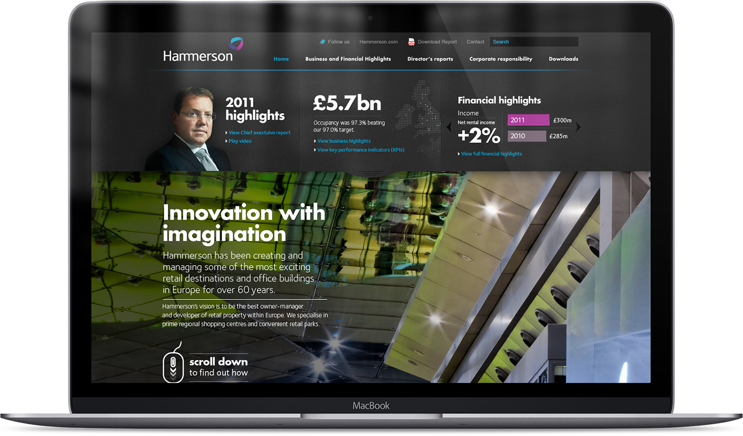
Hammerson Annual Report
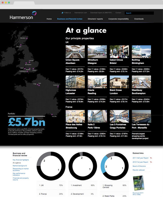
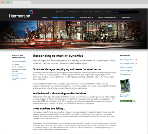
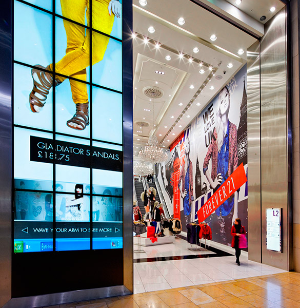
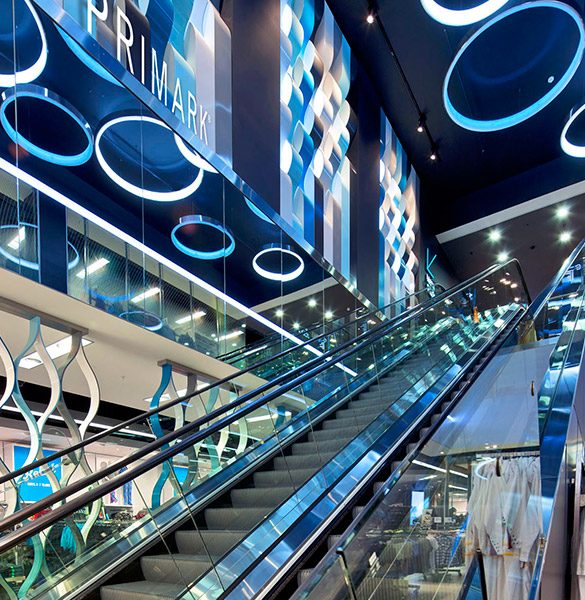
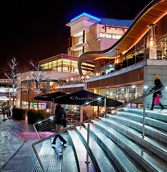
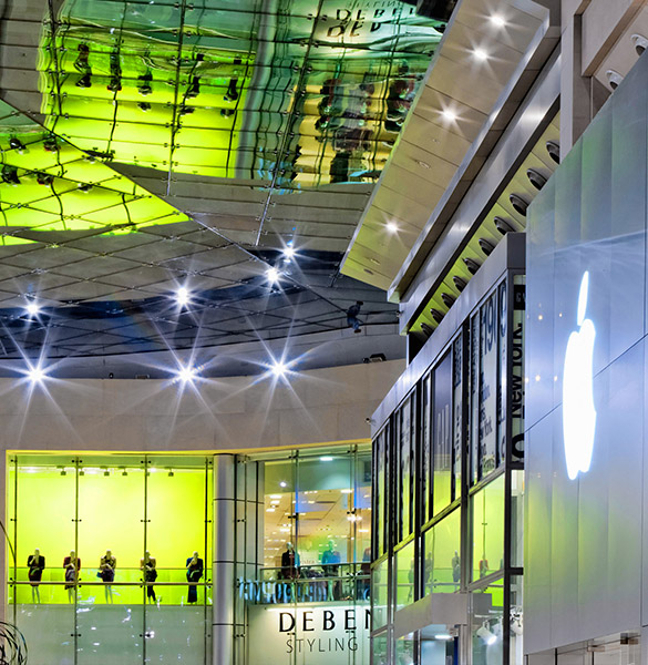
Before, Hammerson's Annual Report website was boring and very traditional. The client wanted to be "innovative" and "different". So this micosite features Paralax scroll within the long page , which brings out the beautiful images. A first for a website in this category.
So what did you actually do?
How do you make an annual report website exciting? I asked myself the same question, and challenged the UX to create something more interesting. The photography was so strong that I really wanted to feature them as much as possible. I pushed for the parallax style and created the overall visual design plus UI.
Agency:
SalterbaxterMSL, London
Roles:
Visual Design, UI, UX
Visual Design
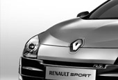
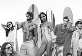
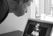
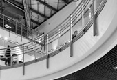
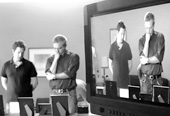
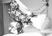
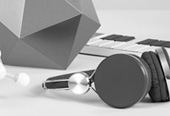
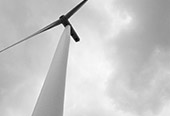
Have a look below to see some screen grabs from the site.
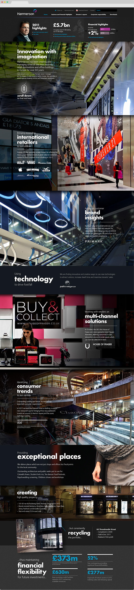
Homepage transitions
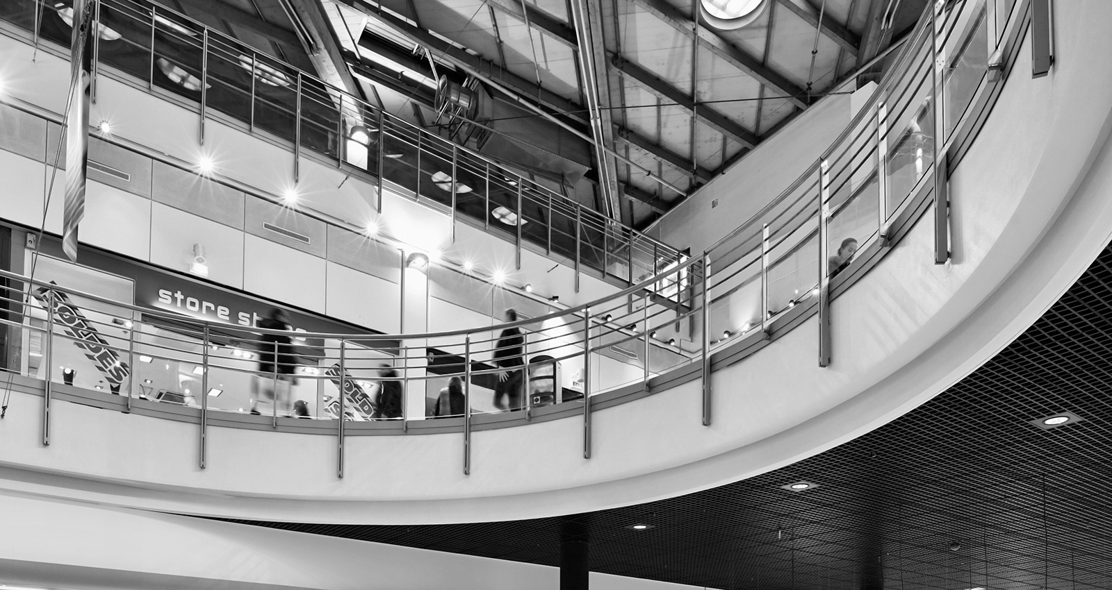
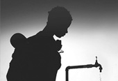
Photography
Copyright 2016 Frederik Samuel Design
![]()
![]()
![]()
![]()